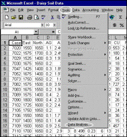
Calculation of percentiles in MS-Excel
The data to be processed
consist of soil ICP analyses for Ba (-80 mesh fraction, aqua-regia digestion,
0.5 gram aliquot) from the Daisy Creek prospect, Montana.
Step 1 |
Step 2 |
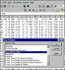
|
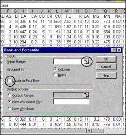
Step 3 Clicking on
the icon on the right enables the input data to be selected using the mouse
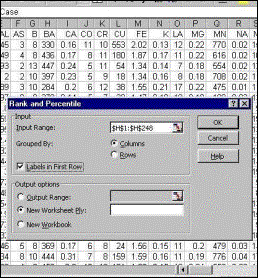
(see Step 4). The checkbox on the left must
be checked if the identifying variable is to appear in the output. |
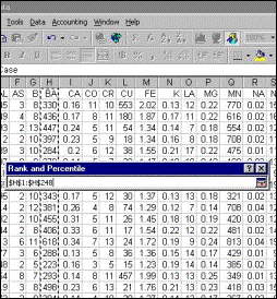
Step 4 More than one variable can be selected but in this instance only Ba will be processed. Clicking on the icon on the right of the box will return to the main Rank and Percentile window. |
|
Step 5 Click on the “OK” to perform the calculations. |
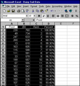
Step 6 Output is written into a new worksheet. |
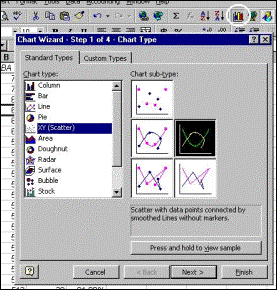
Plotting
of calculated percentiles to generate a cumulative frequency graph
Input data are percentiles
calculated above.
|
Step 1 Click on the “Chart Wizard” window |
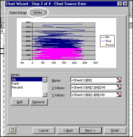
Step 2 Click on the “Series” tab and remove the existing “default” entries, if any. |
|
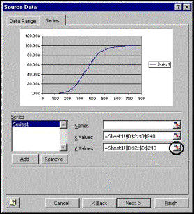
Step 3 Clicking on the circled icon enables the data to be selected by dragging the mouse over the input data (not shown here) |
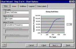
Step 4 Titles and axis labels are added. |
|
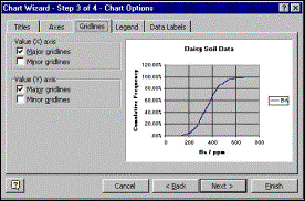
Step 5 X-axis gridlines are added (default is y-axis gridlines only) |
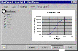
Step 6 Legend is removed by clicking on circled checkbox. |
|
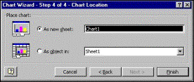
Step 7 Chart is directed to new worksheet (default is to create chart in an existing sheet) |
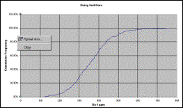
Step 8 Preliminary Result. Reformatting of axis begins with right-clicking mouse over it. |
|
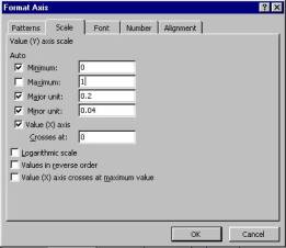
Step 9 Y-axis
maximum is changed to 1 (100%) from 1.2 (120%) |
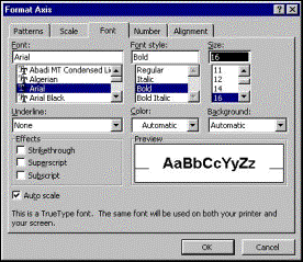
Step 10 Axis fonts are emboldened and increased in size. |
|
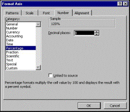
Step 11 Numbers on Y-axis are reformatted to percentages with no decimal places. Axis reformatting is complete and “OK” can be clicked. |
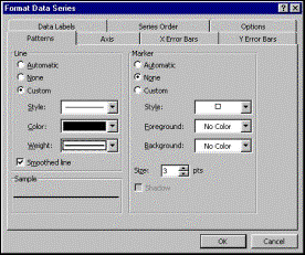
Step 12 Cumulative-frequency line is thickened after right-clicking mouse over it (not shown). |
|
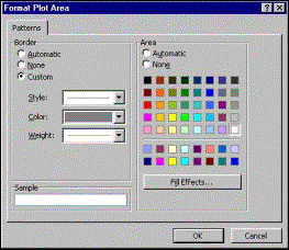
Step 13 Background is changed to white. Reformatting is complete and “OK” can be clicked again. |
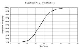
Final Result. |